There are some reports, some information which you need out of a database, which are more complex than others; and which, because of the complexity of the data structures in the database, can mean that the best way for such reports to be produced are often for the database supplier to create such reports as ‘pre-defined’ reports within the system.
The list below details six such reports which I would like a fundraising database to be able to automatically produce ‘out of the box’:
- Attrition report for regular givers
This can be one of the hardest things for an ‘end user’ (or even a database manager) to be able to report on without a supplier’s input – and yet it is one of the most sought after and important metrics for a fundraising manager. Of course, it needs flexibility too - because attrition can mean different things to different managers, for different types of income and over different periods. For example, a regular donor who donates once a year may have ‘attrited’ if they don’t pay one month after their expected anniversary; whereas a monthly donor might need 2+ months of non-payment before they can truly be said to have stopped donating.
- New donors/upgrades/downgrades/re-started etc.
A very useful overview for any fundraising manager is to be able to see a snapshot of new donors, upgrades, downgrades, stayed-the-same, lapsed and re-started. And compared by any period (usually, year by year).
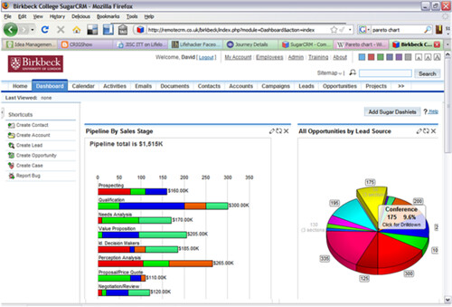
- Prospect pipeline stage report
For major donors/prospects, it is a key thing to be able to see at what stage in the cultivation process any individual is, and the pipeline for all such prospects, probably broken down for each fundraiser/team. And to know not just numbers, but how long they have been at each stage, averages, propensity for giving and so on.
- Pareto report
The (now) classic breakdown which shows, usually in percentiles, just how much income is coming from each such percentile of our database, and which often shows Pareto's 80/20 rule. Oh, and we want to be able to then drill-down into each segment please so we can see the specific information on each donor. It's not an overly-sophisticated report in terms of data output, but it can be difficult to create for end-users.
- Cumulative income of each source/appeal, fund, campaign etc
Most databases can tell us how much we have raised for each fund, source etc. But it is as useful to be able to see this (as a graph) over a time period, so we can see how each such fund/source has progressed over time. And to be able to compare multiple funds/sources etc on the same report/graph.
- Lifetime values
Lifetime value calculations can be very difficult. Because although it can be a simple ‘how much has someone given’ calculation, for the more sophisticated marketer, they will want to be able to incorporate spend, time periods, maybe include/exclude particular segments, use more complex formulas. And to be able to analyse this by each source, first appeal/campaign responded to, type of donor etc. To have better knowledge like this would be so useful to many fundraising departments.
Not much to ask, is it?!
What reports would you like to see? Give me your wish-lists in the Comments below.

No comments:
Post a Comment